During my fourth year into my software development career, and I decided to update my CV because of the ugliness and the lack of content for my former version. During giving a refreshing look, I found a weird trend in CV writing when I was browsing many CV templates; there are many templates attempting to use a bar chart rating system to show their skill levels, something looking like the following:
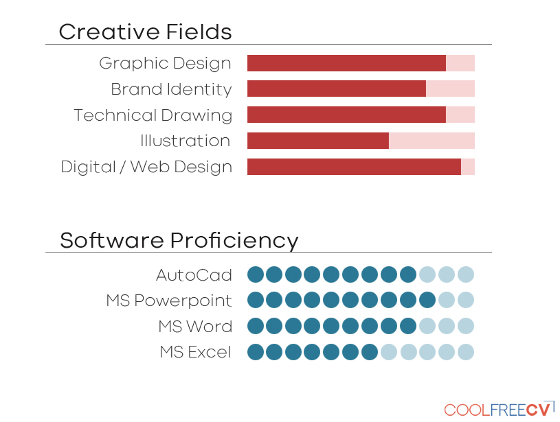
I don’t know who made this, but they are unlucky enough to become an example.
While they look kinda cool and interesting at the first glance, I found them weird because these kind of charts instantly remind me of how Transformers represent their abilities, like shown:
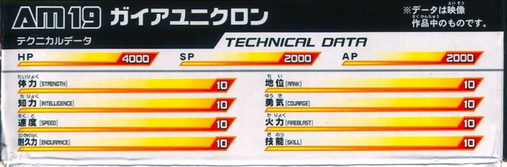
Ah yes, everything is 10/10, I aM pErFeCt!
Aren’t CV formal documents? I mean, tech spec bar charts work for Transformers toys because they are marketing strategies that provides some fun ways to let kids to know about the ability of a fellow Cybertronus Cybertronii; on the other hand, CVs are formal which we should clearly show our experience and skills in a clear way, not to make someone looks like a comic or cartoon character to entertain people.
Alright, perhaps I am too strict about the CV format, so let’s assume CV format can be semi-formal and some cool looking visuals are allowed, but the bar charts still don’t work for a critical reason: lack of context or definition for comparison. For example:
Programming skills
Java: ⬜️⬜️⬜️⬜️⬜️⬜️⬜️⬜️⬜️⬛️
I know I will exaggerate a little, but what are the 9 white squares mean? Proficient level? Java 9? Codewars level 9kyu (not even a beginner)? Unlike the IELTS level system, or the codewars difficultly level, the levels in the CV neither have formal definition nor have an objective agreement, meaning that we can define any skill level on any number; my level 9 can mean progress to the beginner level while you can mean expert, and we don’t have an agreement between those numbers, so no one can tell what the 9 squares really mean.
Let’s move on to a worse variants of the tech spec, introducing the percentage pie chart or bar chart!
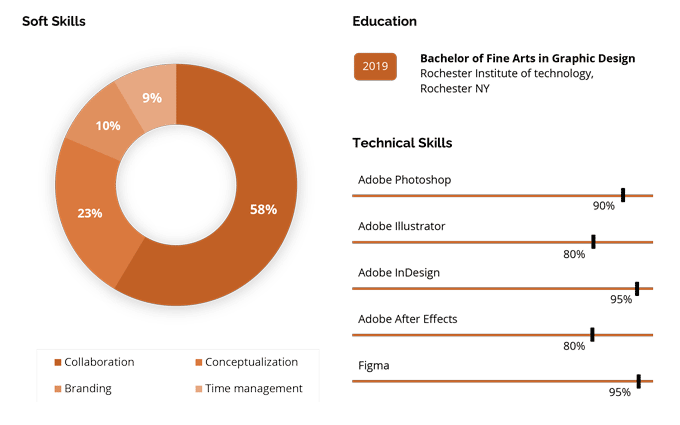
Sorry resume genius… sometimes you have some good ideas, but this chart has too many issues.
So… When I was looking at the pie chart, my instinct told me his time management had only achieved to 9%, meaning that he had trouble on tracking time and he might late a lot; meanwhile, his other skills weren’t that spectacular either, even his best quality, collaboration, was just about average (58%). For the technical skills, I was wondering how did that person have the confident to say he knows 95% of all knowledge in inDesign? How could he managed to know how much he don’t know? These can be Disasters for that person because not only his fancy charts didn’t work and the numbers make no sense, but he was also misinterpreted as someone who is bad at doing most of the things other than collaboration, and being ignorant and dishonest over his technical knowledge.
When I was preparing IELTS and learning from Nick Nicely, who was a great English Teacher, but sadly, he has disappeared. He had inspired me a lot in different topics, from our familiar technical Computer Science topic to cognitive bias. In one of the IELTS lesson, I have learnt a lot of valuable skills about the efficient ways to analyze and summarize the main features of charts, and this also made me realize what and how charts are really used: comparing things changing over time or in different categories, seeing their trend, maximum and minimum, extreme changes, or how they converted / diverted, using clear and informative illustrations. Clearly, those CV charts break all purposes of being a chart, putting meaningless numbers and ratios which not only have no meaningful measurement, but they are also misleading which hurt someone’s career.
Now, I am going to use the java example I mentioned before, replacing with text description:
Programming skills
– 4 years in Java 17
This is not only looks more professional and more elegant, but everyone who know English also immediately know the level and how updated the Java knowledge about that programmer; personally, I can also see the confidence and honesty of the writer, and not to hide something untold. Not everyone would agree my idea, but if there are two CVs with the same amount of content, and one of them using charts while vise versa for another one, I would definitely consider the one presenting their skills textually.
I don’t know, I wrote this with full of confusion because I have no idea why people want to use a bar chart for their CV; while I understand that we need some cool visuals and designs to attract others to increase the opportunity to get an interview, these CV charts simply don’t click me because those charts makes no sense and they miss the whole point of using charts. I am not a Transformers seeker, but I will be a job seeker in the future, so I will and I shall write my skill set in words rather than the Transformers tech-spec.
Soar • Beyond; learn for life.
(Logickin written with confusion)